Hannah & Liam
Hannah and Liam wanted a very organic but playful branding for their wedding stationary. They wanted to incorporate illustrations that represent their lives such as sailboats, nature, and their two pugs! I decided to hand-draw every illustration by hand to maintain the organic look and use that throughout the branding.
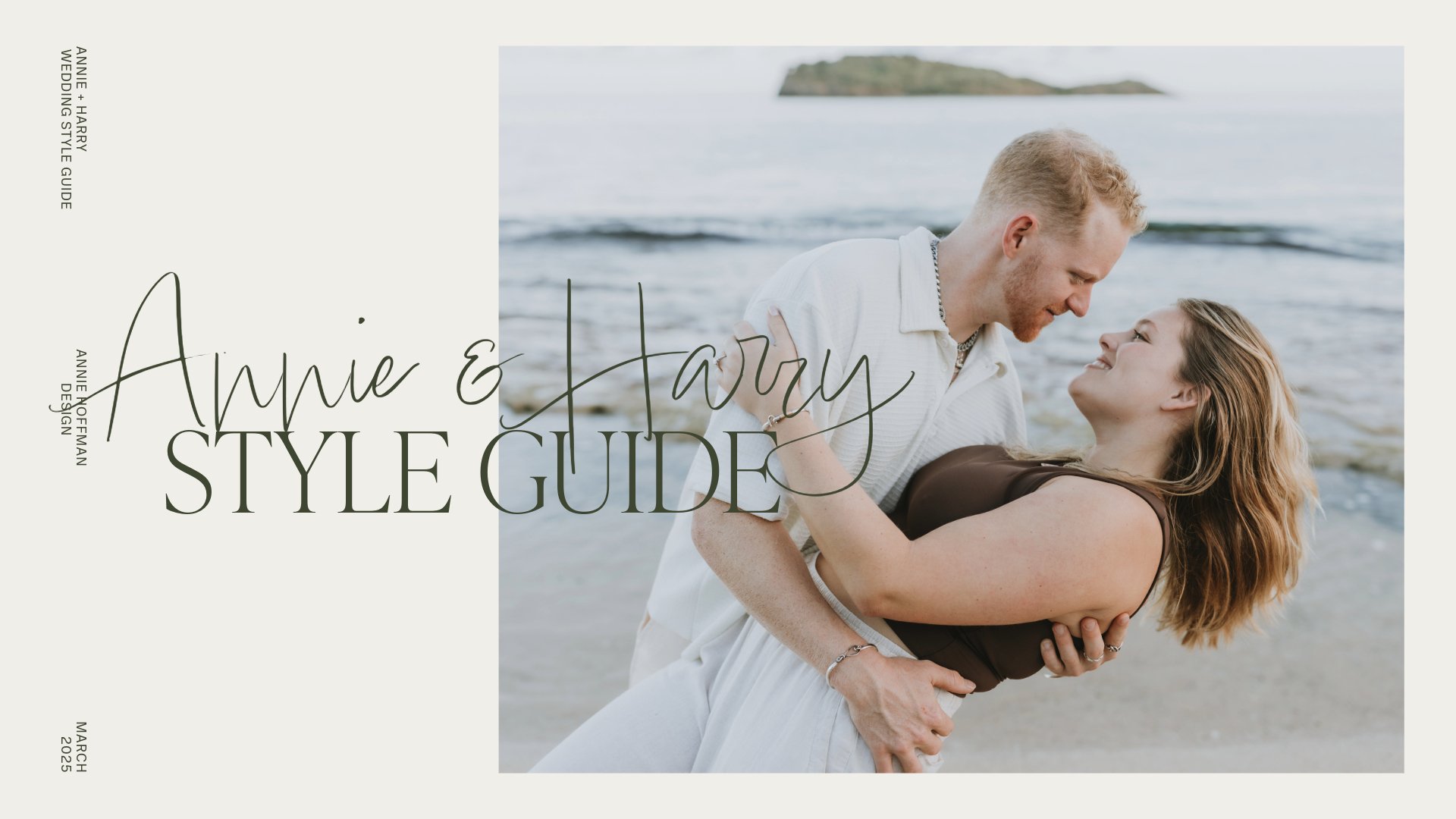
Harry & Annie
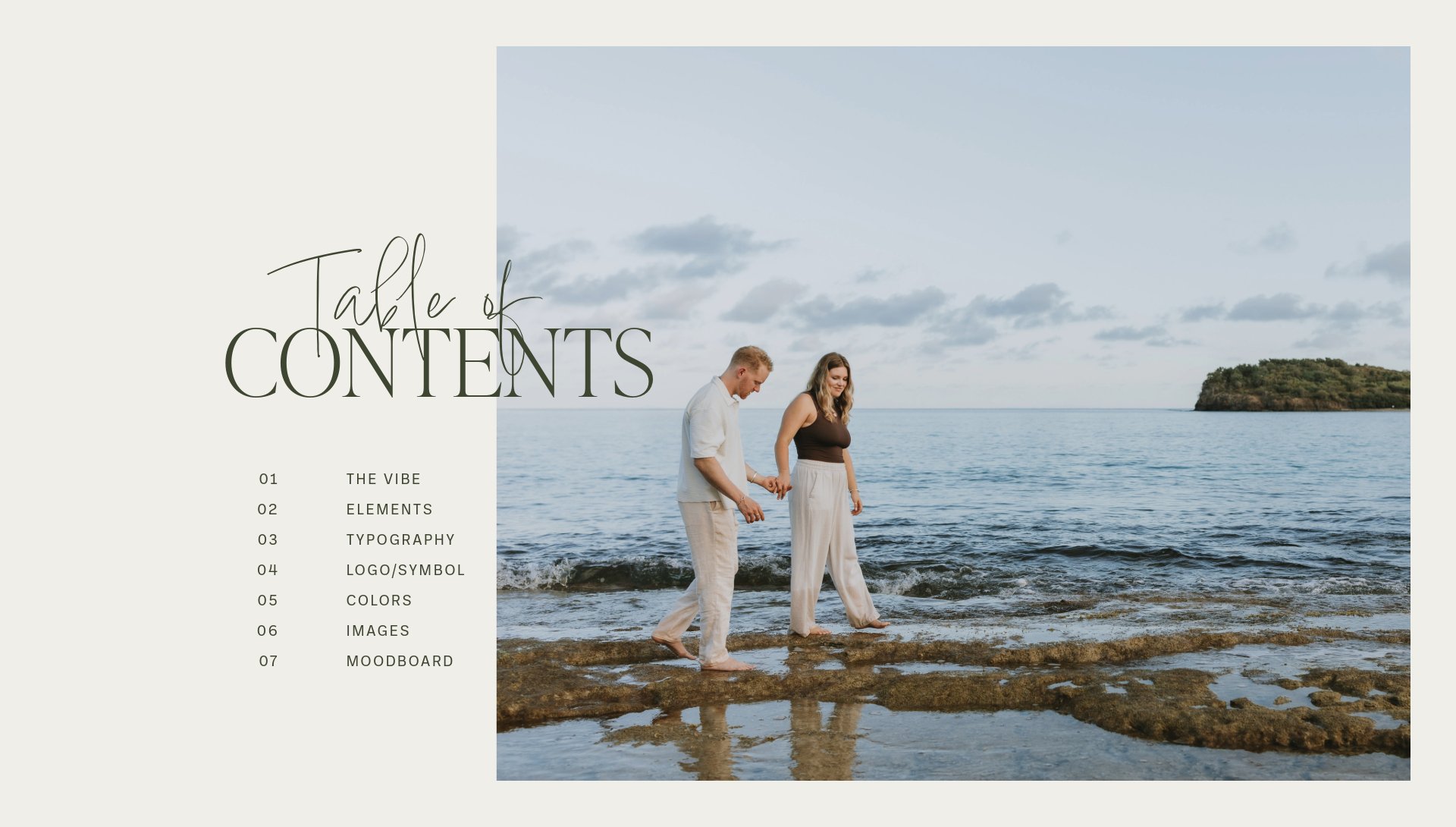
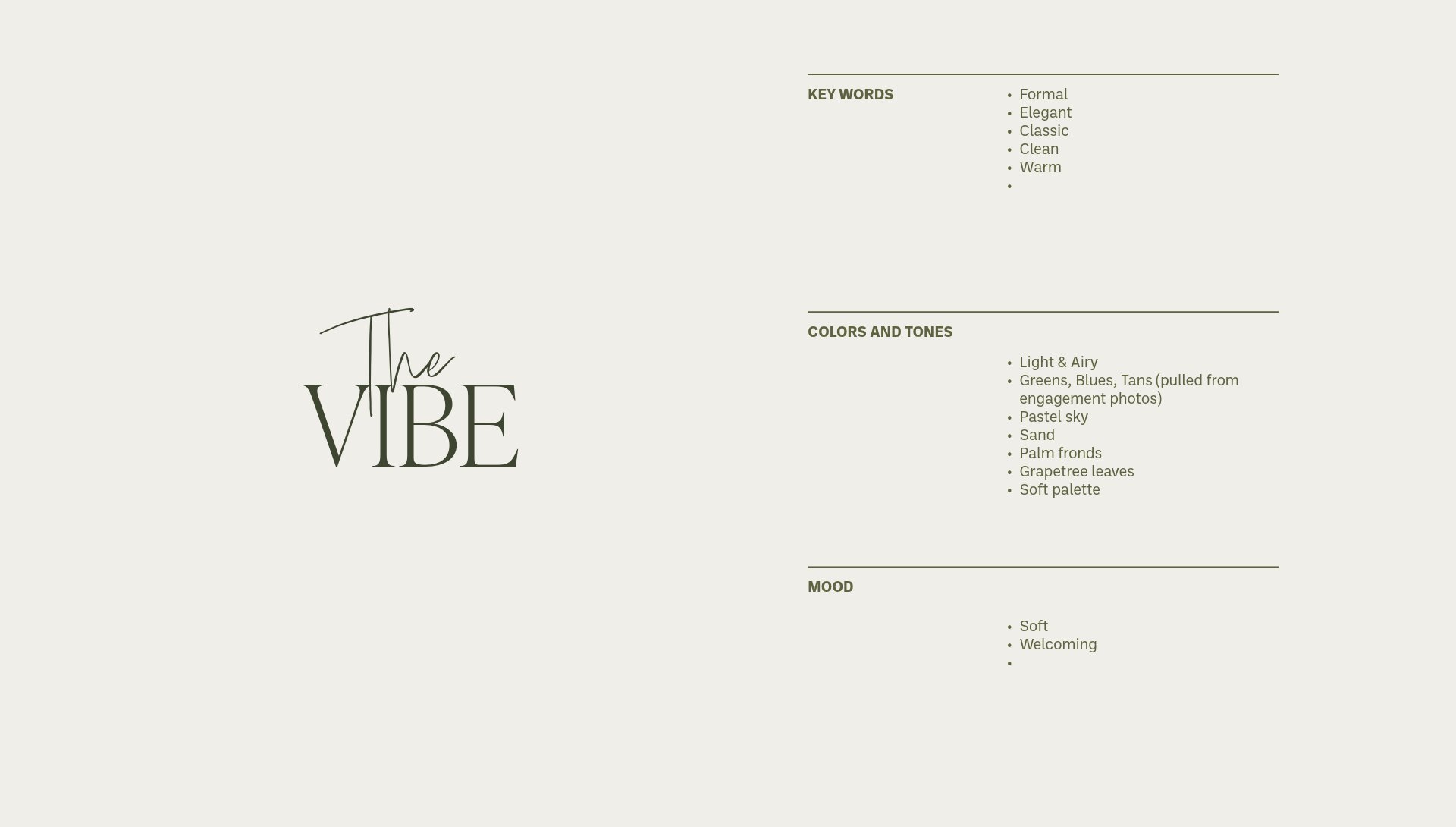
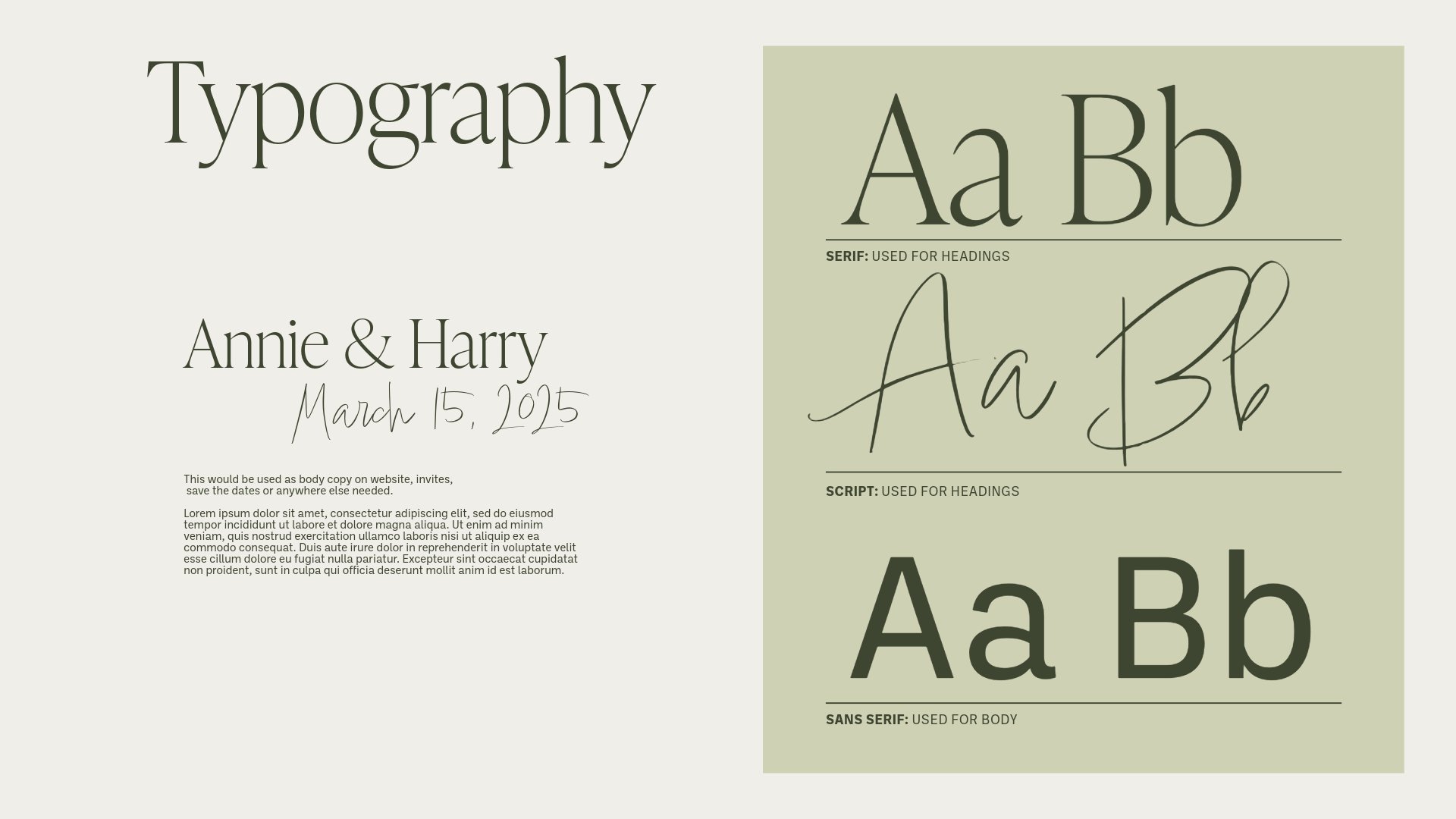
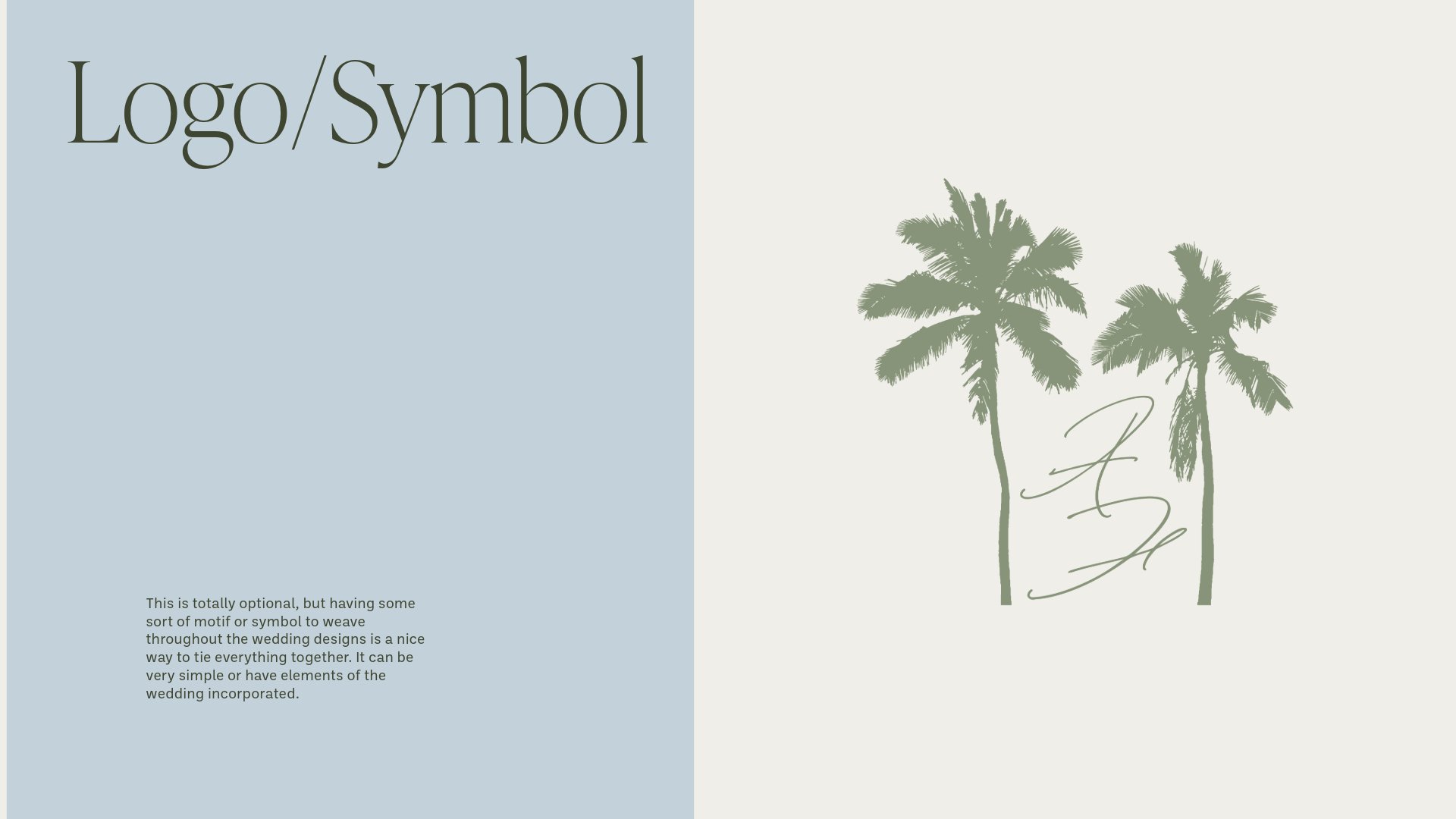
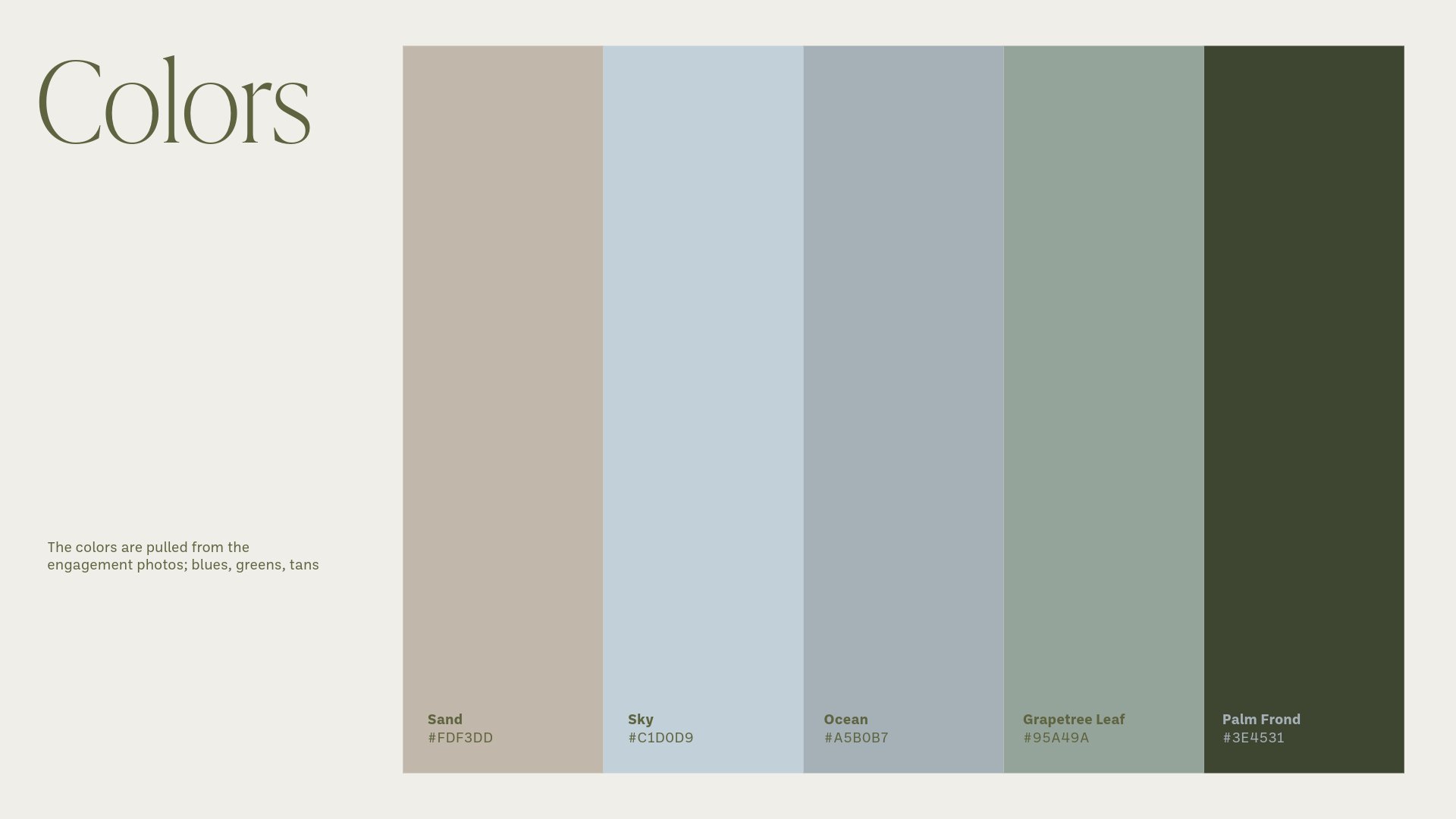
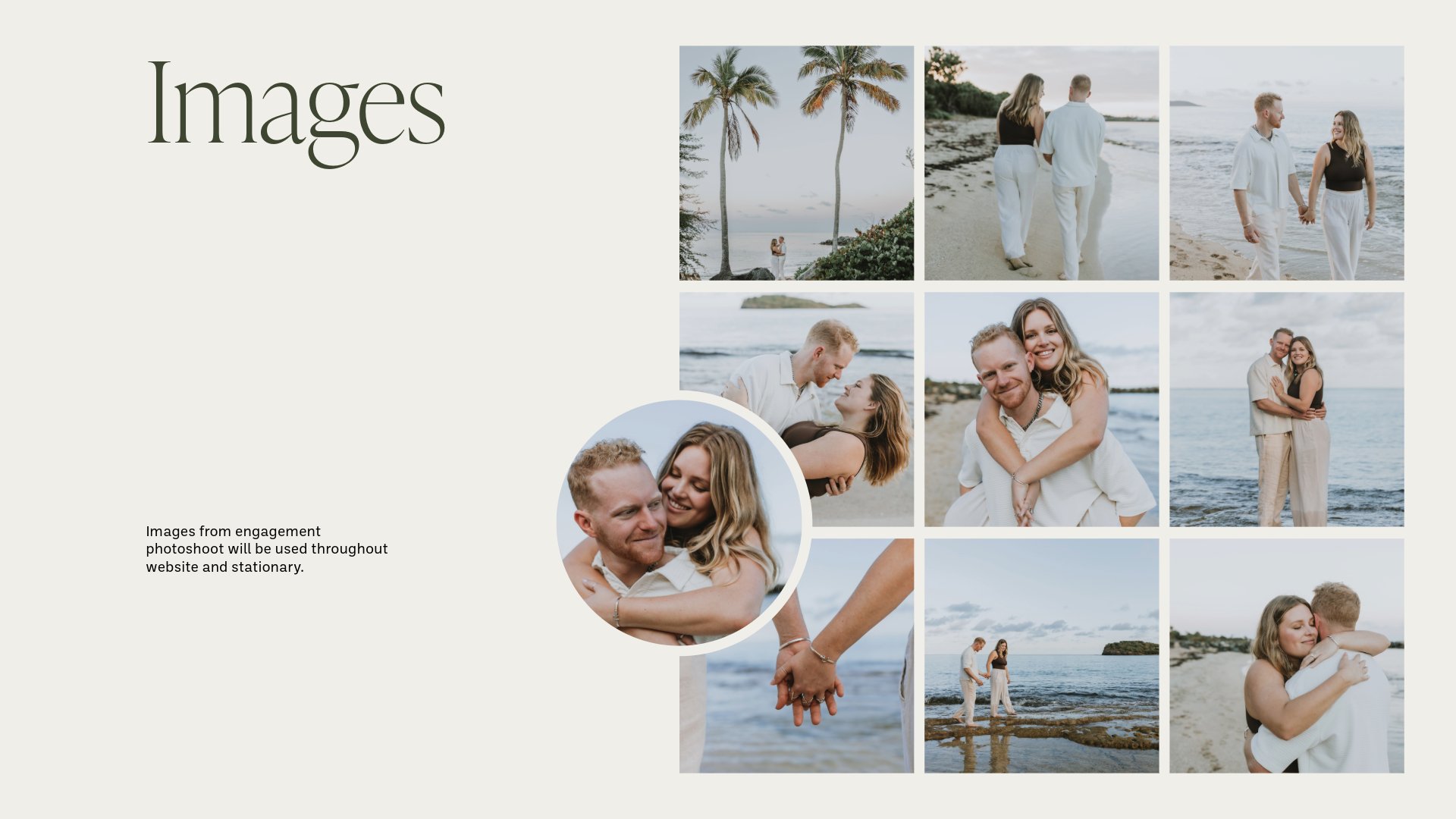
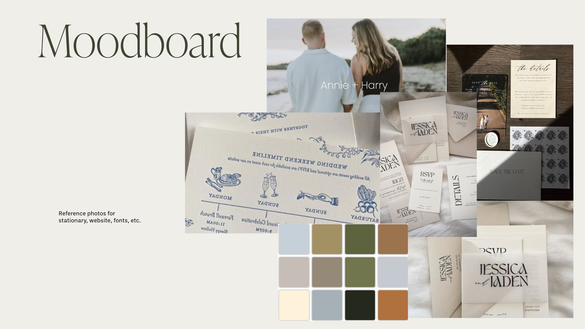
Harry and Annie wanted an elegant style for their wedding stationery. They wanted to incorporate the colors from the engagement photos into the branding elements of the invites and RSVPs. I decided to take the two palm trees from their main photo to use as their logo and branded their wedding website using the style guide I created for them.
Since the Save the Dates were more formal, Annie wanted the Bachelorette invites to be more colorful and playful. The color reflects the color of a Lambrusco wine, along with illustrations of wine glasses and bottles since the trip took place in the wine country of Sonoma, CA.
